
Texas Solar Homeowners Savings Report
Helping Texas solar homeowners navigate the deregulated and confusing energy market to find the best plan for their needs. An interactive web-based visualization project.
In partnership with Solar United Neighbors , Texas Power Guide , and Mission:data
We designed and developed a dedicated microsite to communicate the results of a study looking at savings for existing solar homeowners, and to give viewers a dynamic way to explore how various factors influence the choice of energy plans.
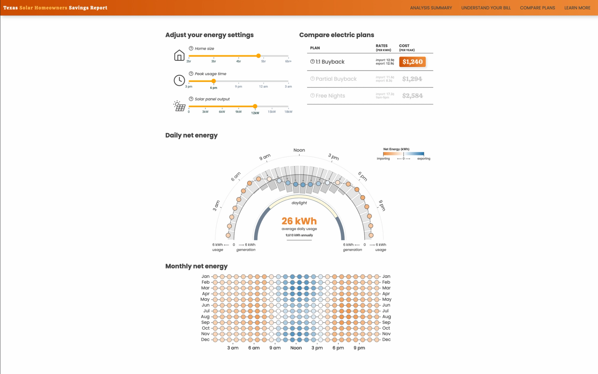
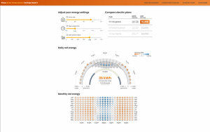
The creative challenge began with figuring out how to build an interactive tool to let viewers explore the different factors affecting energy costs. Part of this task relied on deciding which variables to surface (e.g. things like home size, or hours of sun per day), and an appropriate range of values to assign to each variable.
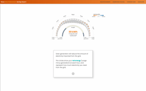
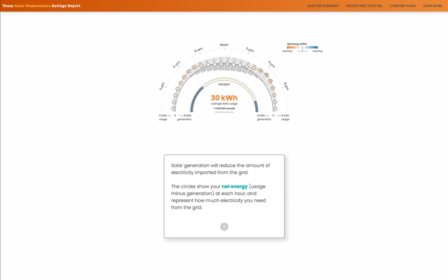
Ultimately, we needed a function that would take in all of these values and output the amount of energy derived from the solar panels vs. taken from the grid, and use those values to calculate an estimated energy bill under various plan options.
Working with Observable notebooks at this stage allowed us to quickly iterate on the logic and visualize the results, and provided a way for fast prototyping with the data experts on the team to make sure the outputs matched real-world expectations.
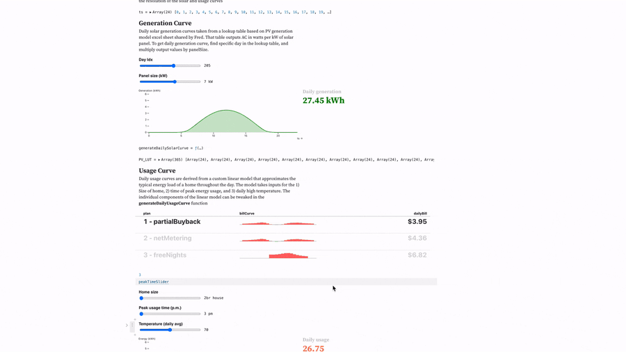
Once the basic pieces were tested and functional, we shifted to designing how the final visualization would look and behave. A major advantage of using Observable was that instead of having to replicate all of the logic on the front end, we built the visualization to dynamically read in functions from the notebook. In addition to nicely separating the functional logic from the visual logic, it also means that if the team ever wants to update the functions in the future, they can simply change the notebook and those changes will immediately be propagated to the live site.
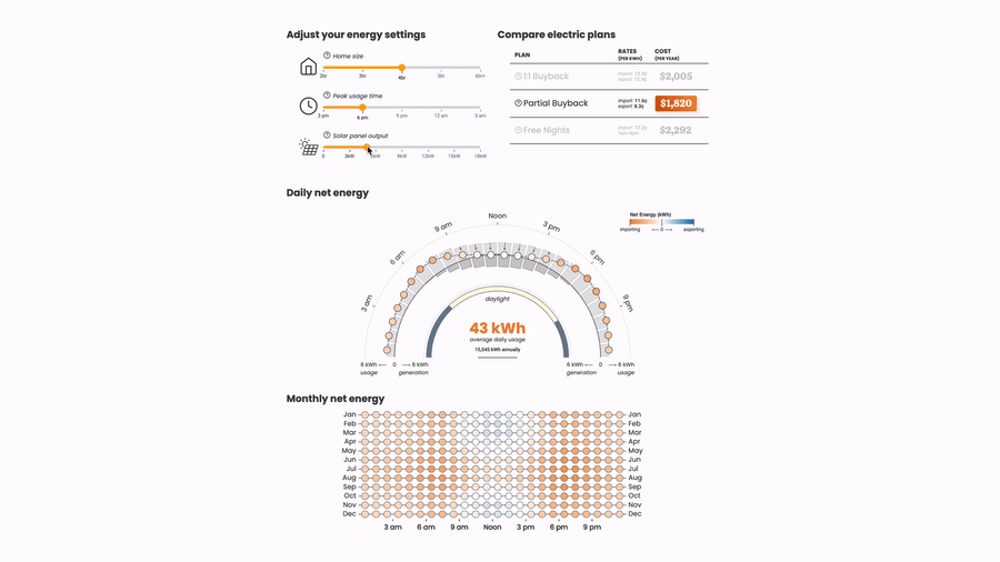
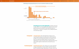
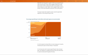
The rest of the site used a mix of static and dynamic graphics interspersed with narrative text to walk viewers through the results of the study and to acquaint them with the different types of plans that are available and how to find the right one to fit their needs.
Decimal Point
1417 NW 54th St
Suite 372
Seattle, WA 98117
info@decimalpoint.studio