Air Mass Visualization Builder

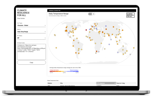
We designed and developed a dynamic chart builder for Climate Resilience for All that lets their team build customized interactive views of evolving global air mass data and generate embed codes for use anywhere.

We partnered with Climate Resilience for All to build a chart builder that puts their air mass research directly into the hands of their team. The tool allows the CRA team and research partners to explore temperature trends across five distinct visualization types — from a global map showing warming rates at 100+ weather stations, to regional rankings, yearly trends at specific cities, and frequency analyses showing how often dangerous air masses occur. Each view can be customized by metric, air mass type, region, and other parameters, with embed codes generated automatically for use in presentations, reports, and external websites.
The project draws on the same underlying research as CRA's report on dangerous summer air masses , which found that nighttime temperatures during extreme heat events are rising far faster than daytime temperatures. This tool extends that work, giving the CRA team flexibility to surface specific slices of the data for different audiences and contexts. Similarly, we used Observable notebooks to prototype visualization approaches and determine appropriate data cleaning and preprocessing steps, then moved to a production front-end build.


A core challenge was ensuring that visualizations produced coherent, meaningful output across all the different configurations each chart type offered — the same consistent design language needed to work whether showing a global overview or a single station's 30-year trend. The charts also needed to be reliably embeddable, generating clean iframe code that would render correctly across a variety of platforms.
Decimal Point
1417 NW 54th St
Suite 372
Seattle, WA 98117
info@decimalpoint.studio